5 Tricks to Win the Visual Content Game

How do you feel about most of the websites you come across online? Can you tell why you like them?
People are visual. Many even decide on a purchase based on what they see.
- 92.6% of people believe that visuals are a #1 factor that affects their purchase decision
- 90 seconds of initial viewing is enough time to make a judgment about a product
- 85% of the reason people decide to buy is based on color
Getting your visuals right in the digital age is important. If you don’t do it, your competitors will. I know you are in the game to win. So, let’s do it!
1. Use White Space to Trigger Purchases
Ever come across a website that just feels right? Proper usage of white space or “negative space” is what contributes to a balanced and harmonious layout.
White space creates “breathing room,” it contributes to simplicity and UX, because it affects the readability of text and functionality of a website.
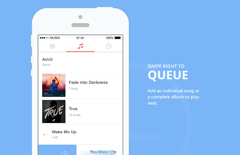
Musio is a great example of web design that just feels right.
There are two ways to use white space. Passive white space improves the overall readability of your text and layout. This occurs when you take actions like putting paragraphs in text to improve the way information is presented, rather than overtly influencing the reader.
Active white space is when it gets interesting. It can be used to influence a reader by guiding from one element to another, and in such way that it triggers a purchase.
Have you seen recommendations to add more room around your calls to action? That’s because white space around a target element helps your readers focus on taking action. White space adds emphasis.
Are you using white space to improve readability, simplify, improve your UX and sell more?
You should!
2. A/B Test Your Color Combination
What is the best color for your call to action? Green or red? The battles over the “right color” for your CTAs continue.

In a button color test run by Hubspot on the home page of Performable, the winner was a red button with 21% increase in conversions.
Yet, green is the color that is “the best” for CTAs from a psychological standpoint. It’s associated with wealth and well-being.
See what I am getting at here? There is no right answer to the question of what is the best color for a CTA, and here is why.
What does matter is color combinations, but one size just doesn’t fit all. Color does influences conversion, but for YOUR website, in your UNIQUE way.
So, what you really want to do is:
- Select the color scheme.
- Figure out your messaging.
- Do A/B testing on the colors of your website.
This way colors can play a huge role.
3. Use Images That Are Worth 1000 Words
Images set an emotional tone. They zap right into the brain and get your readers feeling the emotional tone you want them to.
When it comes to images, you have quite a few options:
- Real life photos of your customers work best.
- Your customers are the heroes. Real images in which they can recognize themselves always work optimally.
- Custom screenshots with the right emphasis.
These are close to real life. In order to put the right emphasis on elements, Skitch is one of the best and simplest tools to use.
- Images cited under creative commons license.
To find images available for commercial use, you can use Flickr or Creative Commons Search. You can also use Google Advanced Image Search and set usage rights to “free to use or share, even commercially”.
- Stock photos.
Be realistic with these. None will believe that the cheesy faces on your home page are really your team. Still, if you want to give it a try, Shutterstock and Unsplash are the right places.
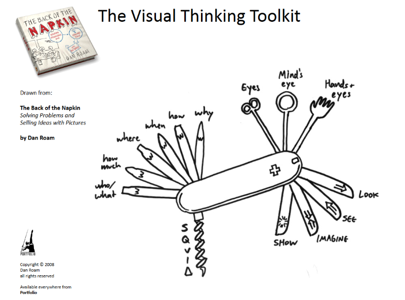
- Hand-drawn explanatory images.
Drawings are one the best ways to explain anything to anyone. In fact, it’s one of the easiest ways to communicate complex problems in a way so that everyone will understand it.
To get started, all you need is a pen and a paper, and maybe some inspiration from Dan Roam.
4. Use Infographics as Part of Your Marketing Strategy
While infographics are great for data visualization, many companies are reluctant to try it as a marketing technique.
The results of infographics can be huge. You may see 401% or more traffic growth and a 4480%+ increase in lead growth.
To get started and get it done, you can use visual.ly or picktochart.
Do you use infographics as a part of your content marketing strategy?
You should.
5. Use Visual Storytelling Techniques
Visual storytelling is the right language to communicate in during the age of information overload. Visual storytelling helps create meaning among a wealth of information. It’s a way to connect with your customer on both emotional and intellectual levels, and guide them along their journey.
Here is a great visual story of a cake recipe

Your Turn
Now you can add to your visual content arsenal:
- White space as a way to trigger purchase and influence your readers on an emotional level.
- Color scheme tests, as one size doesn’t fit all.
- Hand drawn images that are worth 1000 words.
- Infographics to grow backlinks, traffic, and revenue.
- Visual storytelling to communicate a story that resonates.
What visual techniques do you use? What works best for you? Share in the comments below!

Comments (0)