5 Tips to Make Your Facebook Page Attractive
If you’re trying to harness the power of Facebook to market your business, great content and lots of engagement are only 2 pieces of the puzzle. To really make the most of your presence on this popular social network, you need your business page to be attractive.
Why is an attractive Facebook page important?
- attractiveness = likeability, meaning more fans
- a visually pleasing page is easier for fans to engage with
- fans consume your content more easily
- attractive content is more likely to be shared
Plus, an attractive, branded page looks more professional, amplifying the benefits of being on Facebook. Use these 5 ideas to get started with this social media and make your business Facebook pages more attractive.
Create a Big, Beautiful Cover Photo
Your page’s cover photo and profile picture are the first things visitors see, so you want them to be beautiful, professional, and powerful. Here are some ways to make your cover and profile photos more attractive:
- Include some text in cover photos (no more than 20% text; see Facebook’s guidelines for pages) to tell visitors more about your business. For example, Groove Commerce highlights their monthly webinars in their cover photo.
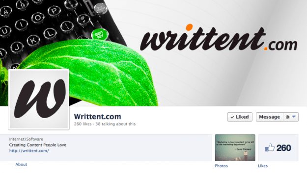
- Cover photos may include your entire logo or be similar to your website header to create a cohesive branded experience. Writtent.com’s Facebook page is a good example.

- Profile photos generally include your logo or a version of it. They can match the cover photo or stand out. The Facebook page of Content Marketing Institute manages to do all three at the same time.
There are many ways to make these visual aspects of your page more attractive. For example, HubSpot uses a bold yet simple branded cover and matching logo profile. SEOMoz takes a unique approach, showing their headquarters of Seattle in the cover and their mascot robot in the profile photo.
Post Lots of Photos, Images, & Videos
Break up polls, links, and other types of posts with lots of multimedia. Any visual you create for your blog or specific media channels, such as videos for YouTube or infographics for Pinterest, can and should also be shared on Facebook. Visual and interactive content are super popular right now and make a more attractive Facebook page.
What should be in your photos, images, and videos?
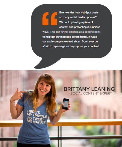
- People! Your fans and customers want to see the human side of the business, and showing employees, customers, and other relevant people does that.

Image courtesy of Hubspot
- Memes. Images that go viral can pack a big punch or make your audience laugh, and sometimes both. Take advantage of images everyone will recognize.
- Products in action. Multimedia of the product being made and used humanize your business, show what you do, and help fans visualize the benefits of your product.
- Images you create. Quotes about your industry or process, infographics depicting statistics and information, testimonials from satisfied customers, and excerpts from your ebook or blog all make excellent and varied visual content for your Facebook page and other channels.
- Events. If you host an event or attend one, take a lot of pictures and create an album on your page. People who were unable to attend can visualize the experience, and those who did can relive it and tag themselves.
Use Great Thumbnail Photos & Descriptions with Links
Of course you want to share links on your Facebook page to your own great content and to relevant content you curate. But too many links, especially those with poor or no thumbnail photos or descriptions, quickly clutter your page and make it unappealing.
There are 2 things you can do to solve this problem: use multimedia and other types of posts more often in addition to links, and include great thumbnail photos and descriptions with your links.
That means including a great custom image with every blog post and article you write. And it means writing powerful meta descriptions that entice both searchers and social media users to click through.
Highlight Important Posts
Most posts appear about the same size. Even with varied posts and multimedia, this uniform size can make a page a bit boring. To combat this, you can highlight certain posts to make them bigger.
Highlighted posts work especially well with attention-grabbing images of the right size. Small images won’t always resize properly, so in this case bigger is better. HubSpot does a great job using highlighted posts to capture visitors’ attention and make a more attractive Facebook page.
Use Your Brand Colors
The logo colors in your cover and/or profile help fans know they’ve found the right business page. Using those colors throughout your page in the content and images you create makes the page more attractive and the experience more cohesive, and it helps draw visitors into conversations and down the page. The HubSpot and Content Marketing Institute Facebook pages are good examples.
What works for you? What other business pages are good examples of what makes an attractive Facebook page? Please share your thoughts in the comments below!

Comments (0)