7 Ways to Add a Brand Personality to Your Website
3-5 seconds. Generally, that’s all the time you have to convince a first-time website visitor to remain on your page, and begin a lasting relationship with your brand. Research by the NN Group has found that while the average website visit lasts less than 60 seconds, the first ten seconds are the most important in how a prospect will perceive your website, and ultimately your company.
That means that fancy flash designs, enormous images, or any other elements which can slow your load time to a crawl are definitely out of the question.
The modern marketer’s job is to create a web experience that communicates everything wonderful and unique about their company in mere seconds. Sounds easy enough, right?
It’s definitely within the realm of possibility to infuse your website with brand personality, without losing an intuitive user experience. Here are some examples of companies getting it completely right:
1. Your Blog
Starting to blog for business is a brilliant way to express brand personality and experience the incredible benefits that come with a solid content marketing strategy. That being said, you definitely don’t need to stick to basic blog layouts. Feel free to spruce up your website content with a fun layout, author bios, and some seriously sassy social media widgets. One enterprise brand that’s nailed a fun blog layout is Southwest Airlines:
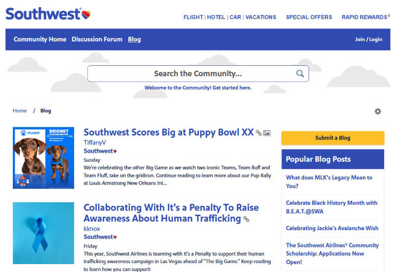
Take a page from Southwest’s book and feel free to “go nuts” customizing your company blog. As long as website visitors can easily navigate your content, connect with you on social media, or become a subscriber, there are few rules about just how many ways you can customize your blog page.
2. Your Social Follow Buttons
Including social media follow buttons on each page of your website is an inbound marketing best practice, but there’s definitely no rule that says you need to adopt cookie-cutter icons to link to your company presence on social networks.
As long as the network is clearly recognizable, the sky and your creativity are the only limits to how much brand personality you can express in your “follow us” widget:
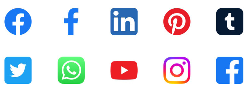
If you’re short of resources or skills to custom-code your own buttons, never fear. There’s an abundance of free social media buttons that are just a download away.
3. Your “About Us” Page
Are you different, better and just more fun than your competition? Then by all means, showcase your brand personality on your website “About Us” page.
Better yet, if you’ve got a large team, let individual interests and personalities shine through to give prospects a comprehensive picture of your entire crew.
One of the most original examples we’ve seen recently of an “About Us” page which stands out comes from video production company LessFilms:
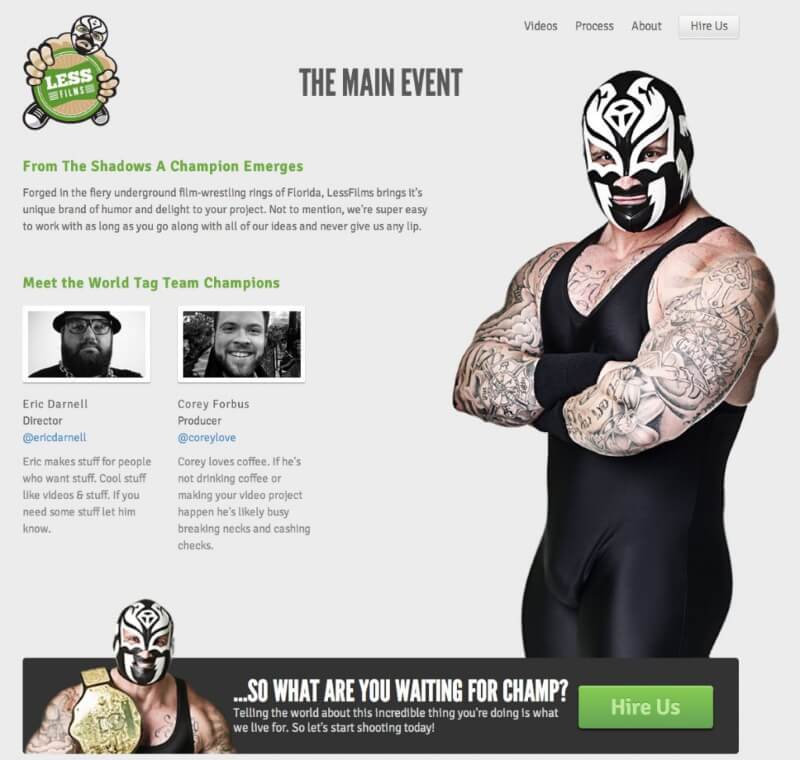
Are either of the co-founders former professional wrestlers? Nope, but they pride themselves on their sense of humor and unique tastes. Keep the technical lingo to your whitepapers and services pages, and use your “About Us” page to express who you really are.
4. Your Website Navigation
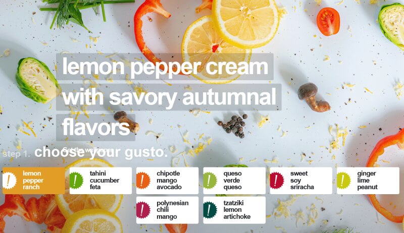
Designing website navigation can actually be really tricky. You want to stand out, but you also want to create something that’s so incredibly intuitive and easy-to-use that any first-time visitor to your company website can immediately start exploring your web presence. The following example from Gusto! definitely breaks the mold by introducing some visually-stimulating elements.
While this navigation has brand personality in abundance, it still manages to present the website’s structure in a way that’s really easy to figure out:
5. Your Spam Disclosure Policy
It’s definitely not a best practice to skimp on a spam disclosure policy, or replace any necessary legal jargon on your website with fun copywriting. However, you don’t need to link to the policy with a boring note of “read our spam policy here.” AppSumo, a daily deals site for geeks and entrepreneurs, has one of the funniest and most-clever spam disclosures we’ve ever read:
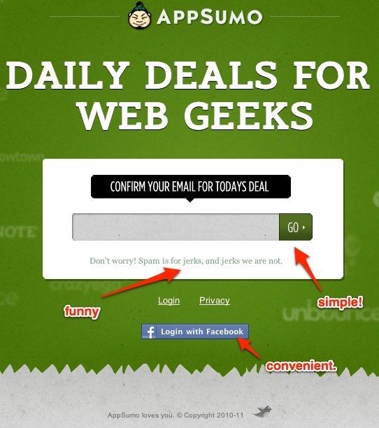
Who doesn’t fall in love with a company that declares “spam is for jerks, and jerks we are not?”
6. Your Call-to-Action Buttons
It’s never prudent to design such incredibly creative call-to-action buttons that your website visitors have to go on a scavenger hunt for your content offers. However, you can express your brand personality to your heart’s content by integrating fun, colorful and easy-to-find buttons in ways that no one ever had before. The following example from Vision18 shows one way that you can integrate CTAs which stand out, without running the risk of looking like everyone else:

7. Your Landing Pages
The purpose of landing pages is to convince website visitors to convert into prospects. There’s a million ways to do this, and the methods which work best largely depend on your buyer personas, and can only be determined through website analytics. That being said, feel free to convince your prospects of the value of your offer in as creative or unusual of a fashion as you desire. The following image from HumanWrit.es shows a company that is able to convey an immense amount of brand personality with only a minimal amount of text:
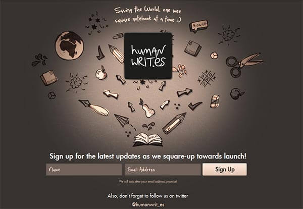
Many web design best practices are the result of years of collective experience, research, and testing by the world’s foremost development experts. Though it’s critical to always keep user experience in mind while devising your next website overhaul, feel free to bend the rules a little to stand out and gain a brand personality-infused edge.
How do you express brand personality on your company website?

Comments (0)